I have my plan for the first assignment mostly nailed down
now –
I am going to make a book - a sort of “exploration of
typography” – hopefully using blurb to show it online once my website is up.
So I’ll be doing one letter, uppercase and lowercase, on
each page, and the concept I’m hoping to portray is this:
Every day we see letters. We see them so often we don’t give
them a second thought. Every day we also see just everyday things around us:
trees, plants, textures of nature, etc. – these two things are so seemingly
natural to our senses that we usually don’t stop to analyze them. Hopefully
this project will put focus on these shapes, textures, and characters that we
see in our lives daily, by using the fact that the two are not naturally seen
together. The daily visuals of these really can go hand in hand together, by
choosing certain natural shapes that will compliment a certain letter, I hope
to bring these two things together into one visually pleasing piece.
I am wanting to have the entire background white, the
uppercase letter also white (only being outlined by whatever high contrast
black and white photo I use), and then the lowercase letter in black, with the
continuation of the photo either being a very, very light grey or white.
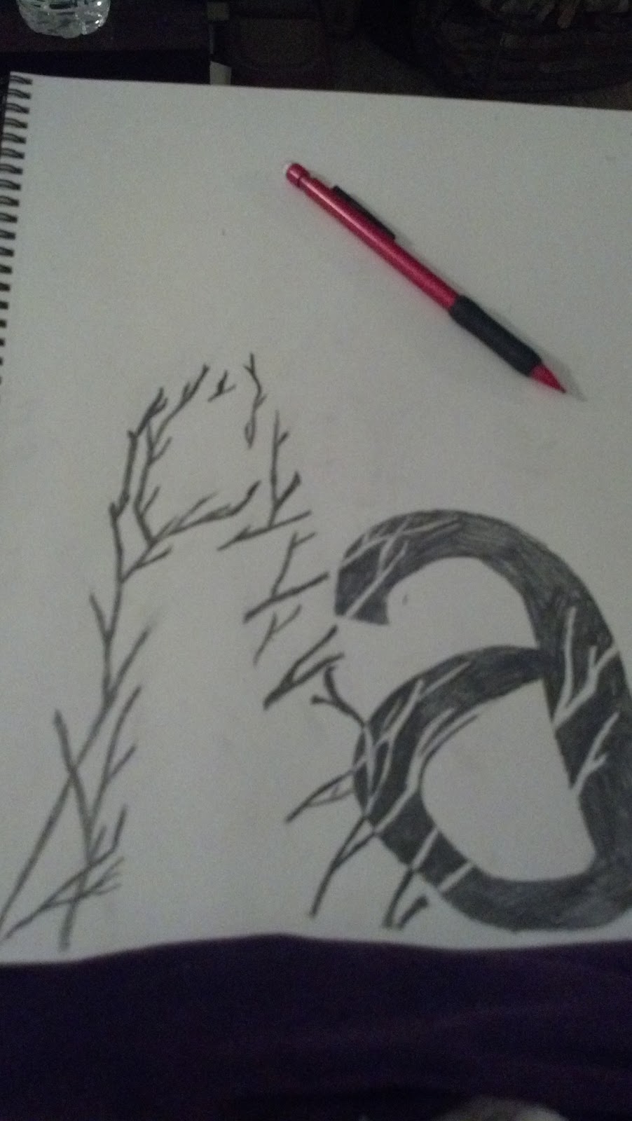
Here's a quick sketch (mirroring my first example that was my inspiration for this) to hopefully illustrate more what I'm talking about. - Obviously the letters I'm using won't be containing all photos of trees, this was just the easiest to sketch out.
No comments:
Post a Comment