Monday, January 28, 2013
Project 1 Update
Took some photos this past weekend. Not nearly as many as I had wanted to because well, the weather was around 15 degrees or less all week.
Saturday I was able to go out to this lighthouse and I got some photos for this project at the beach. I definitely need to finish shooting my photos this week though, hopefully it stops being rainy.
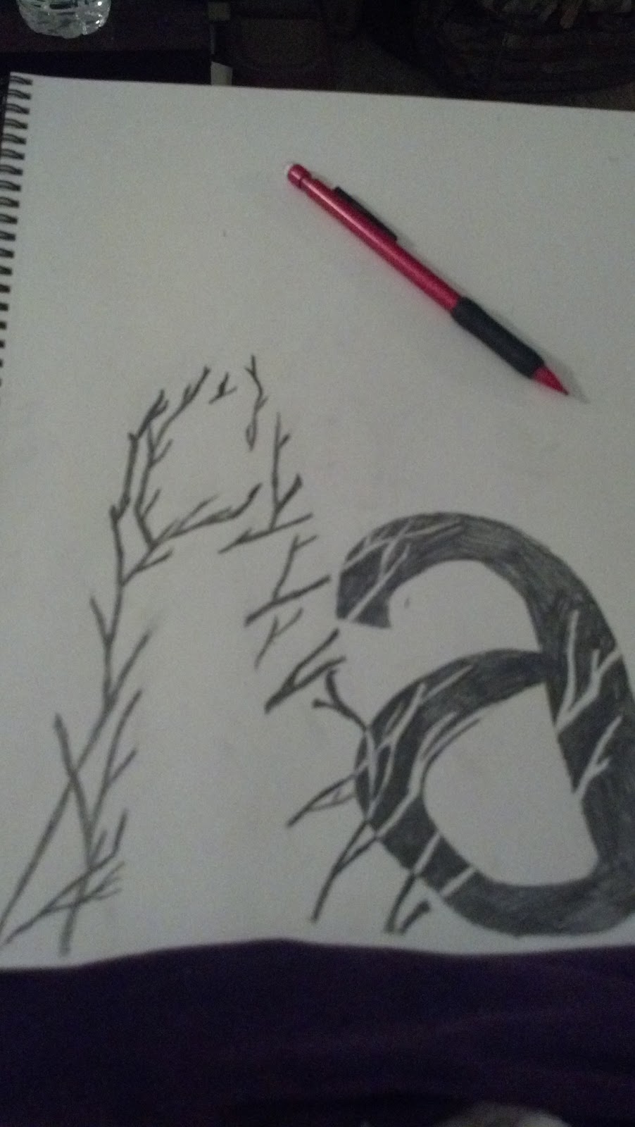
Beyond taking photos though I started to create my first few letter images. And I figured out how to do the editing that I'll need to do for all the letters, so editing them past this point should go pretty quickly.
For the critique next Tuesday, I know I won't have the entire project finished. Thinking probably half the alphabet, but not sure how I should display the project since it won't be in its finished state***.
Currently I started this first letter with a document of 12Wx9H so I'm thinking that is the finished size I'll stick with.
Tuesday, January 22, 2013
2nd project beginnings
I'm starting to think about ideas for the second project -
I love vintage horror movie posters & minimal horror movie posters. So, I think it is easy to see where I am thinking about going with this second project.
I am thinking of either doing 5 (amount can be more I guess) minimal horror movie posters, or vintage stylized horror movie posters. All will be different movies, but I want to keep the style consistent enough for them to be logically shown together.
Here are some that I like. I'm wondering if using titles and the info from the real movies will be a copyright issue? Not sure. -
I'm also not sure if I'll want to take on well known and recognized movies (Frankenstein, Dracula, The Thing, The Exorcist, Night of the Living Dead, etc) or if I should take on the super corny and cheesy basically awful movies that most people have never heard of (The Brain Eaters - which I already did a movie poster for but it was using photography of my own, Critters - awful...and hilarious at the same time, Killer Klowns From Outer Space, Attack of the Killer Tomatoes, Ghoulies, ect)
Here are some that I like ::
some found here
some found here
here
and here.
Monday, January 21, 2013
Update for 1st project
I have my plan for the first assignment mostly nailed down
now –
I am going to make a book - a sort of “exploration of
typography” – hopefully using blurb to show it online once my website is up.
So I’ll be doing one letter, uppercase and lowercase, on
each page, and the concept I’m hoping to portray is this:
Every day we see letters. We see them so often we don’t give
them a second thought. Every day we also see just everyday things around us:
trees, plants, textures of nature, etc. – these two things are so seemingly
natural to our senses that we usually don’t stop to analyze them. Hopefully
this project will put focus on these shapes, textures, and characters that we
see in our lives daily, by using the fact that the two are not naturally seen
together. The daily visuals of these really can go hand in hand together, by
choosing certain natural shapes that will compliment a certain letter, I hope
to bring these two things together into one visually pleasing piece.
I am wanting to have the entire background white, the
uppercase letter also white (only being outlined by whatever high contrast
black and white photo I use), and then the lowercase letter in black, with the
continuation of the photo either being a very, very light grey or white.
Here's a quick sketch (mirroring my first example that was my inspiration for this) to hopefully illustrate more what I'm talking about. - Obviously the letters I'm using won't be containing all photos of trees, this was just the easiest to sketch out.
Wednesday, January 16, 2013
A Dose of Insomnia Does Creativity Good?
Not totally convinced of that. But might as well be productive since my brain has been awake since 4 am
Ran across some things ::
Typography ideas :: I wouldn't say these are the "30 MOST Inspiring Typography Designs" ....But there are a few nice ones:]
Ran across some things ::
This! Perfect timing since hockey is finally back:D
^love this.

More.
I am going to just assume that this made me more productive so note to self: This live set is good quality, cures creative apathy, and passes time much faster:] :: As if I didn't already know that Anthony Raneri - Live Full Set
Tuesday, January 15, 2013
For the first project I am thinking of doing something with typography. I saw this on pinterest:
Here's the link to the artist's actual Flickr site: http://www.flickr.com/photos/martonjancso/6243909354/in/faves-paulgrech/
But I really liked the fact that it looks simple, yet is still visually interesting.
I was thinking maybe I would take inspiration from this and do each letter of my name in a similar way.
Originally I was thinking maybe I could do vector designs in each letter, but now I am leaning more towards doing photography for each. This way I can have a recognizable texture or image to crop and manipulate to fit each letter, and I just like being able to go out and photograph things.
I would want each letter to be a separate, and probably pretty large, document of it's own, but I would display them together. I would probably do each photo I use in black and white, except for maybe the 'T', the 'I' and the 'E' [the only three letters from my first name that are repeated in my last] :: for those it might be nice to make one object, or part of the photo in a color that could then be repeated in the other repeating letters.
Just some thoughts.
Subscribe to:
Posts (Atom)